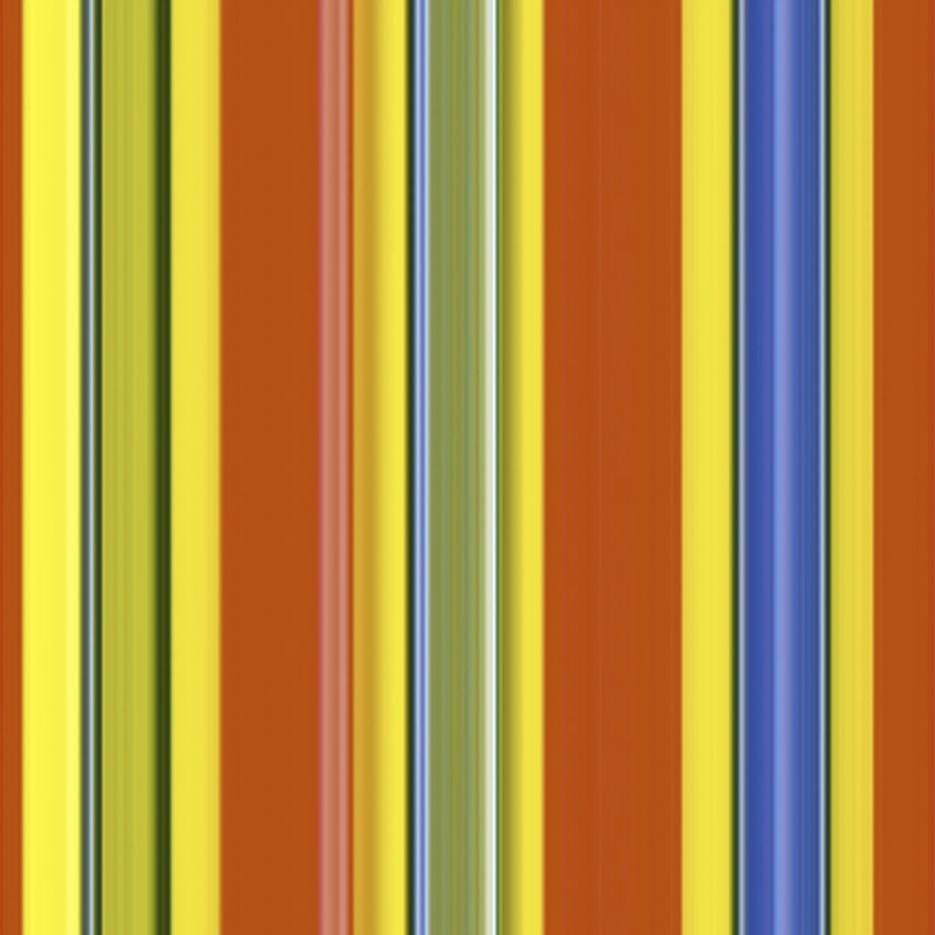
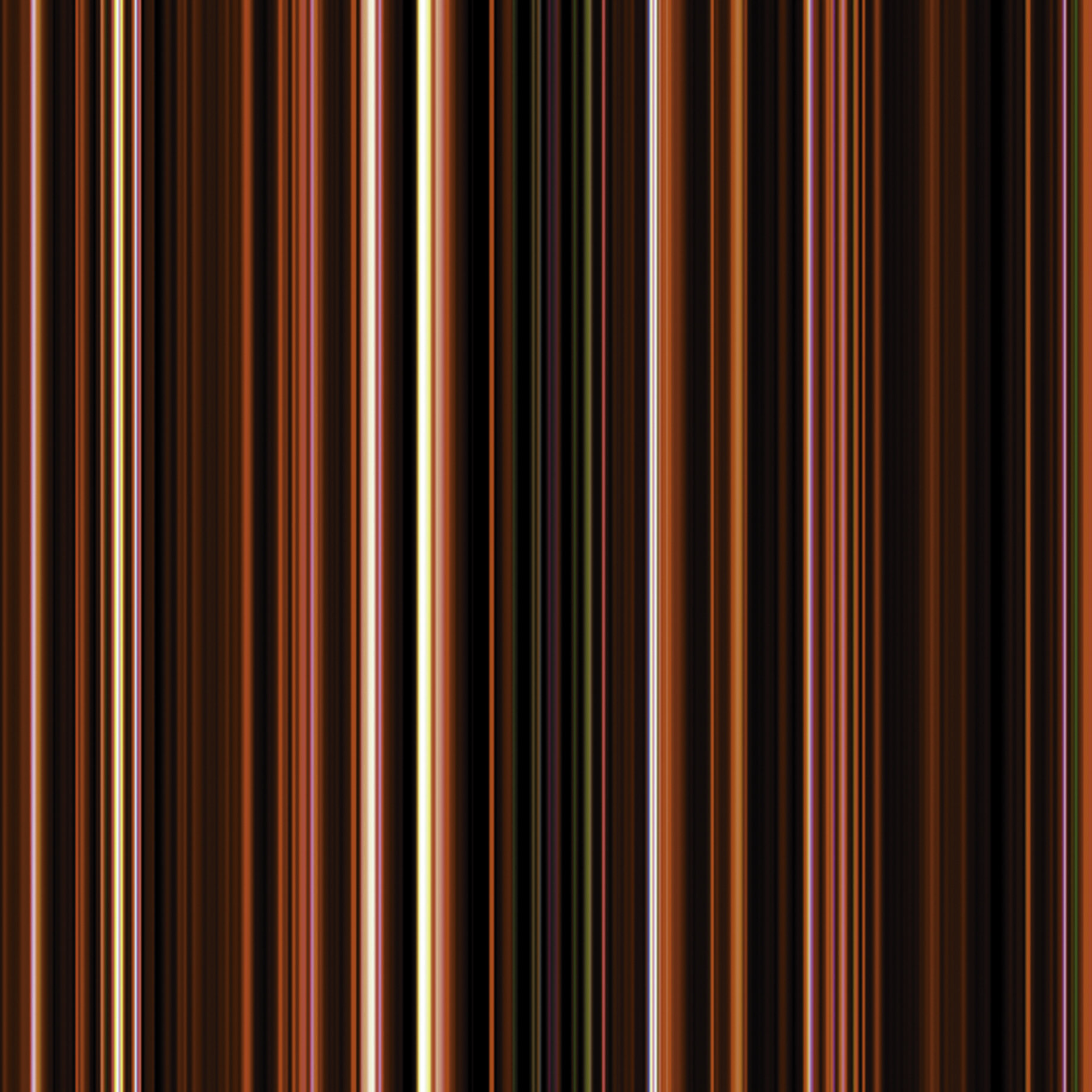
See Candy was inspired by my immigration to the USA, when an unfamiliarity with American brands turned a simple trip to the grocery store into a voyage of discovery. The color coded shapes and symbols that I had taken for granted in British supermarkets no longer applied and the experience felt akin to learning a new language. Having experimented with a range of products including cereals, fizzy drinks, and soup, I eventually narrowed my focus down to the candy aisle, which supplied what I deemed to be a quintessentially American aesthetic. The shiny surfaces, energetic colors, and bold typography epitomized the contrast between the culture that I had left behind and the brave new world that lay before me. In this sense the series can be read as a joyful celebration of my assimilation but there’s also a darker side to these barcodesque abstractions of diabetes-inducing junk! Add to that a color palette that chimes with distant memories of childhood treats and you have the recipe for a surprisingly resonant body of work that stimulates both the heart and the mind, and transcends the personal nature of its origin.